DISCLAIMER: All packaging, logos, icons and other intellectual material relating to Up & Oat is property of summer Fresh. Packaging shown was also contributed to by Creative Director.
Up & Oat: Ready-to-Eat Oat Bowl
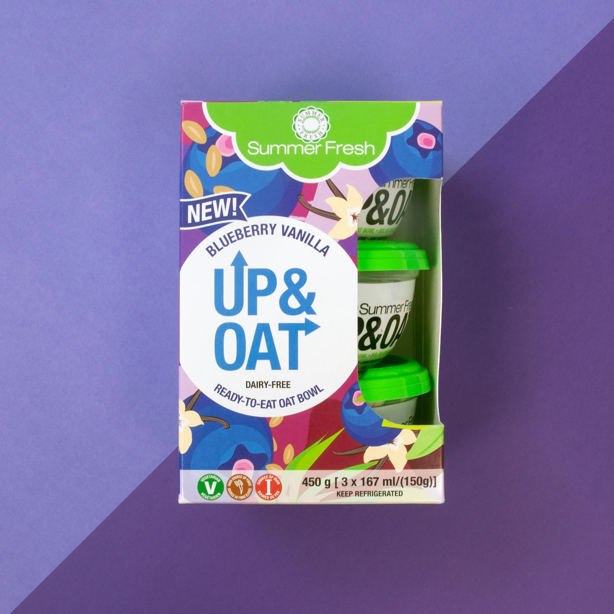
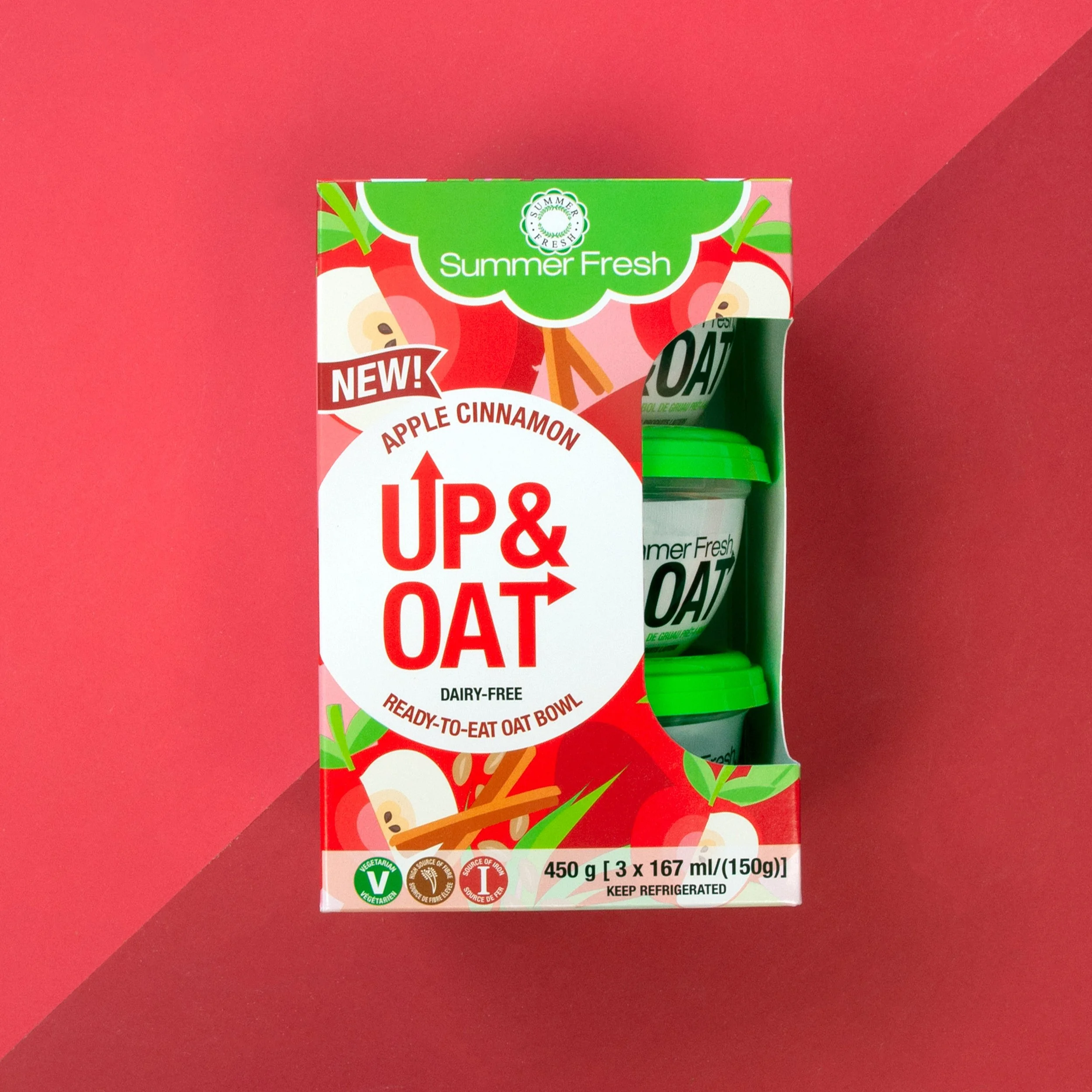
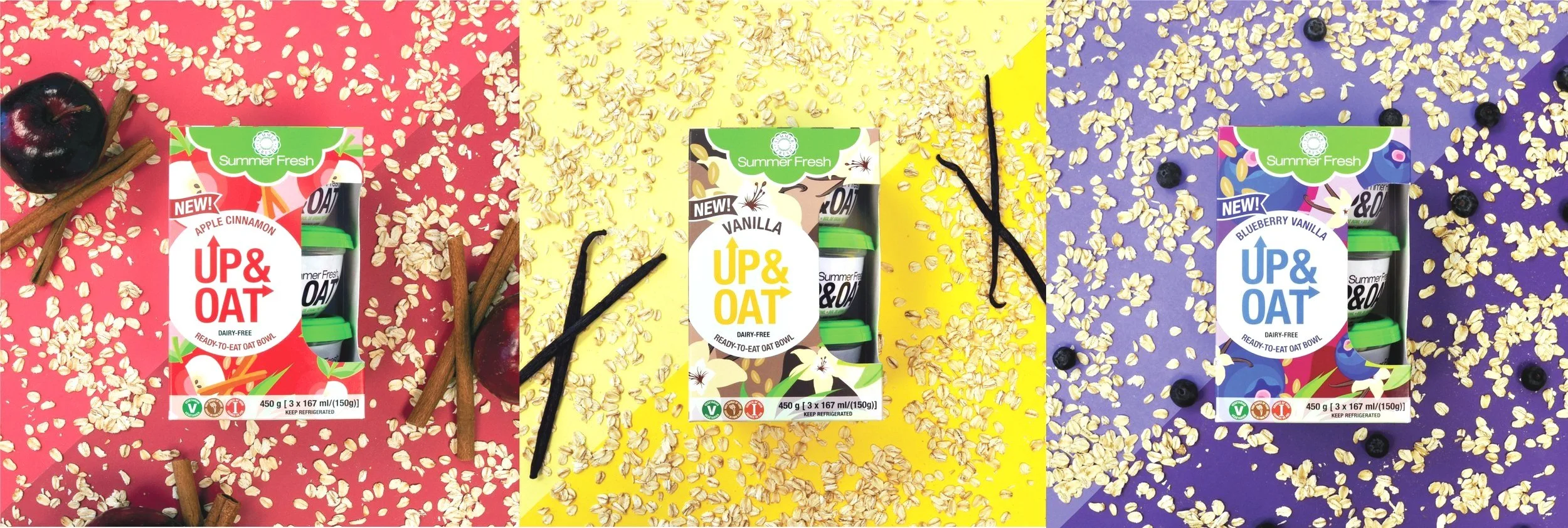
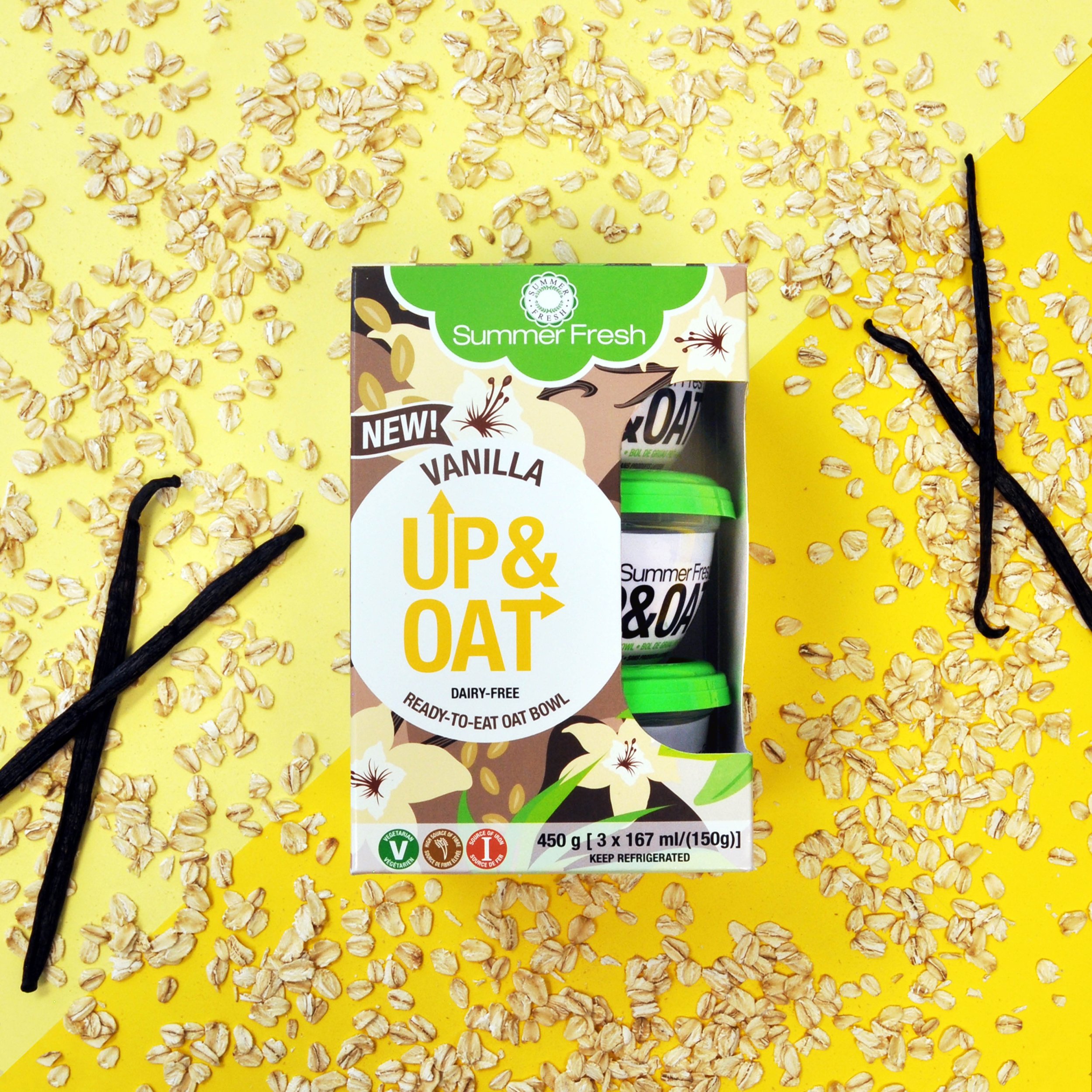
Up & Oat, a prior Summer Fresh product, was marketed as a quick, easy and convenient breakfast. Consisting of 3 different flavour profiles: Apple Cinnamon, Vanilla and Blueberry Vanilla, consumers were presented with a way to make the most important meal of the day a hassle free experience.
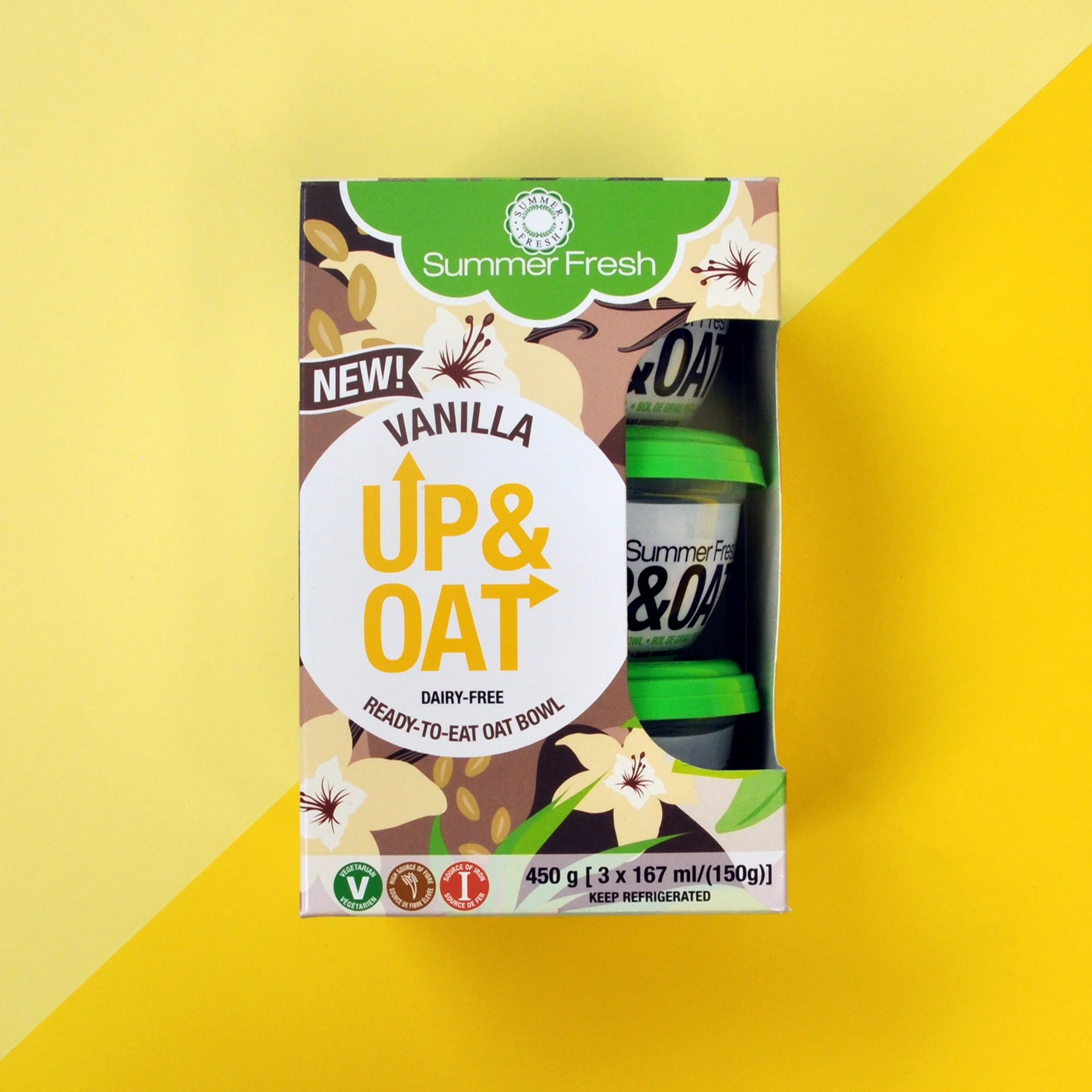
Up & Oat Flavours and Packaging Design
This packaging was intended to stand out from the crowd on shelf. My goal was to include all relevant flavours and ingredients, while also using a colour palette that was diverse enough, while remaining relevant to the main flavours.
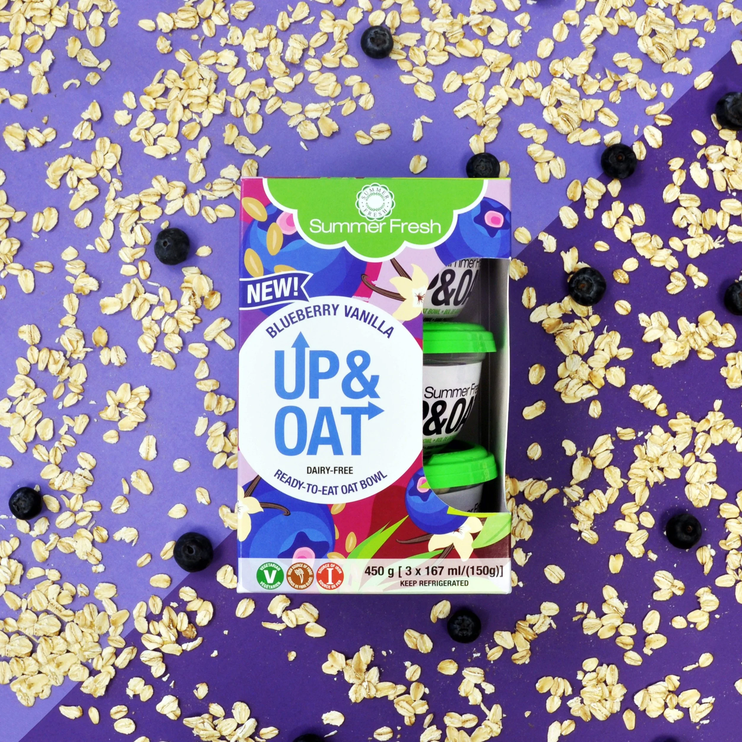
Flavour: Blueberry Vanilla
Design: Key Flavours and Ingredients such as: Vanilla Flower, Blueberries and Steel Cut Oats
Flavour: Vanilla
Design: Key Flavours and Ingredients such as: Vanilla Flower, Steel Cut Oats
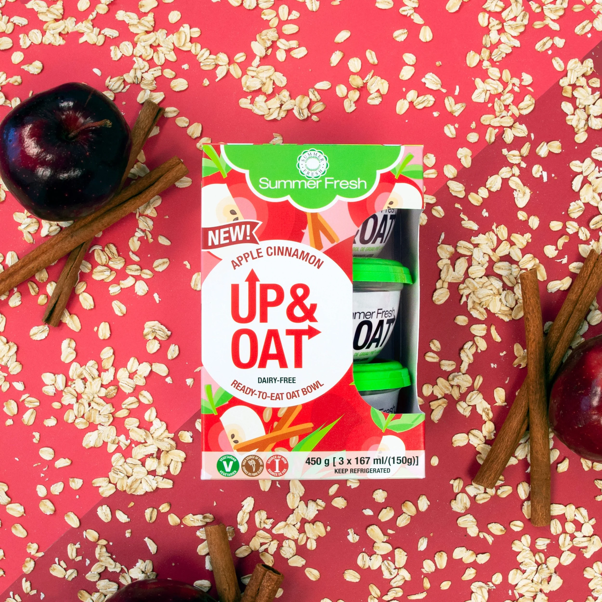
Flavour: Apple Cinnamon
Design: Key Flavours and Ingredients such as: Cinnamon Stick, Apples and Steel Cut Oats
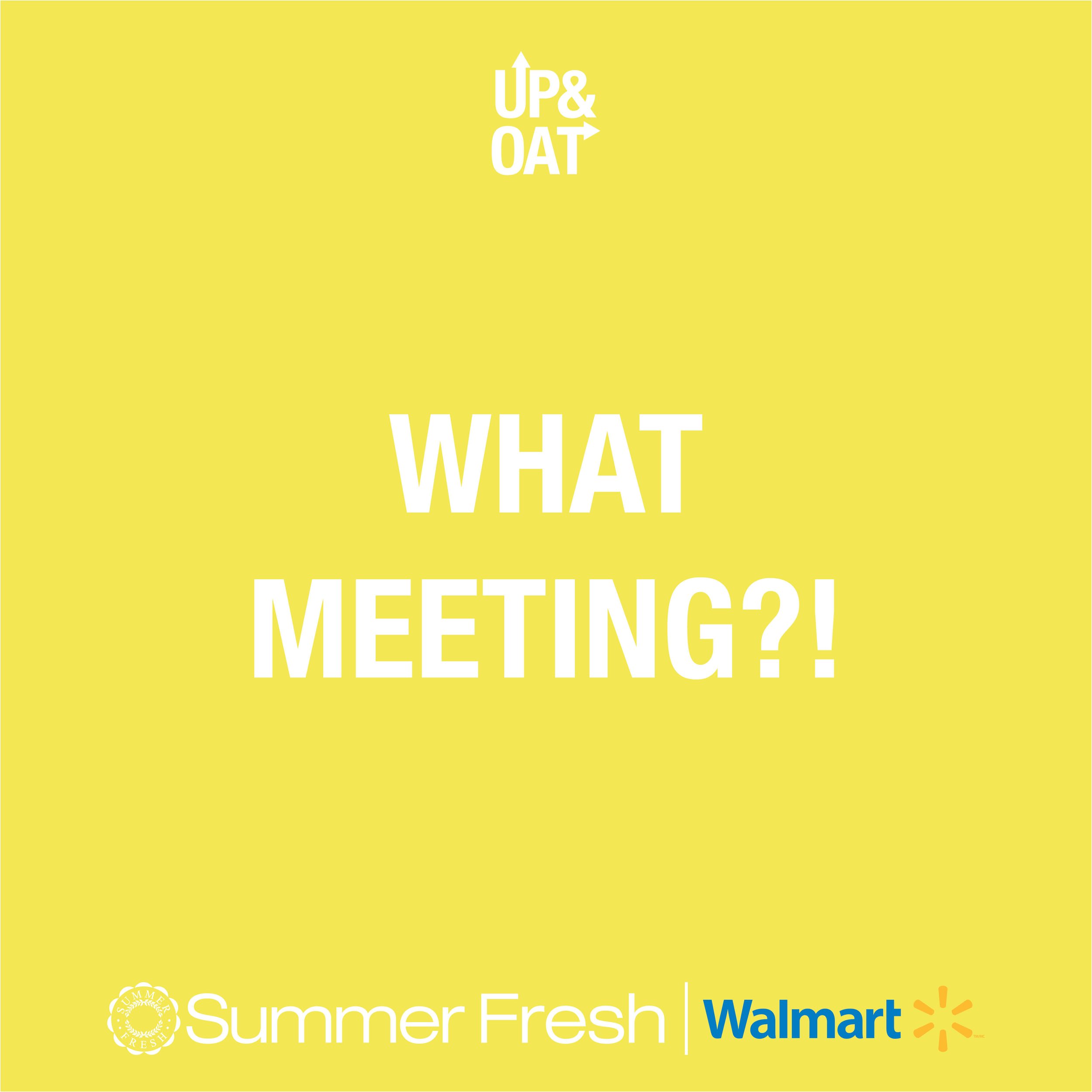
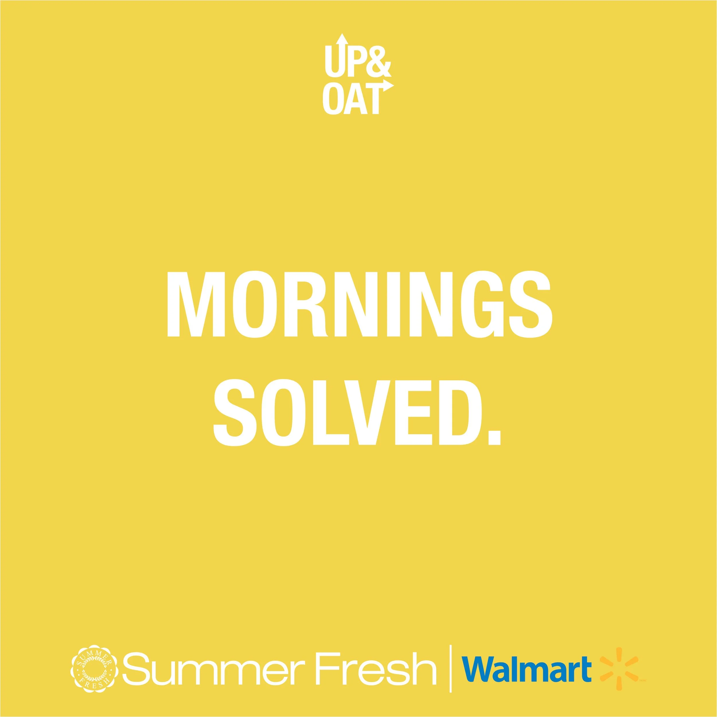
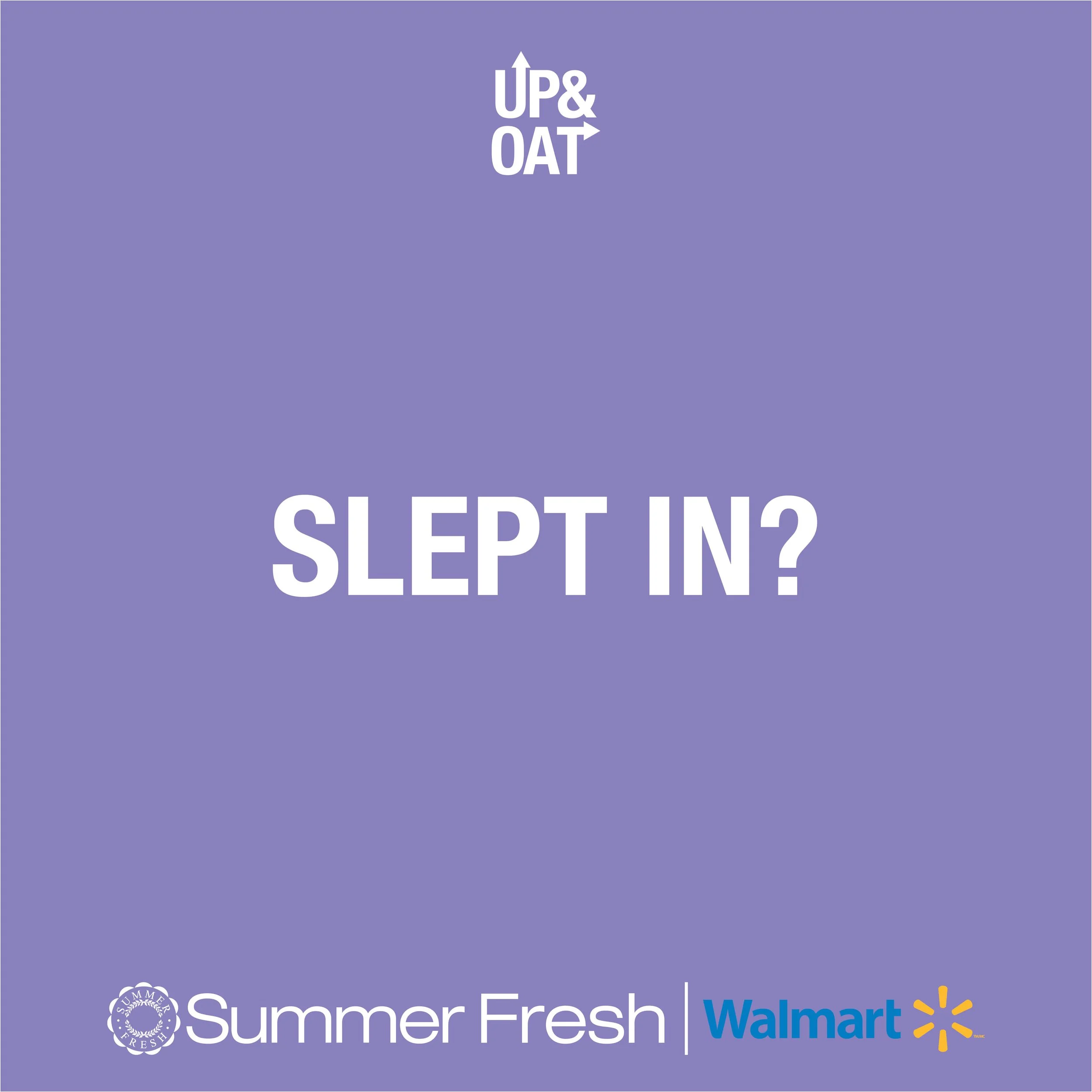
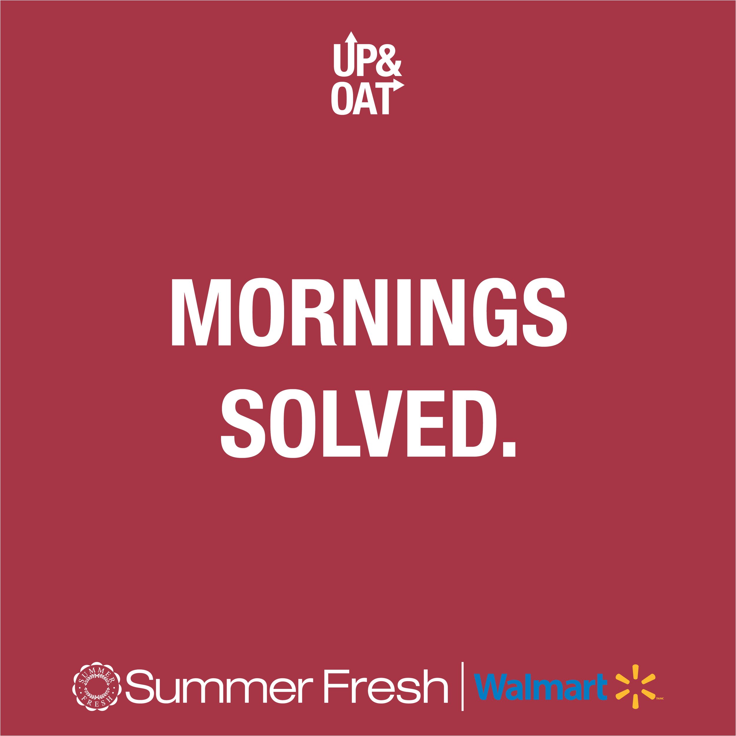
Advertising & Social Approach:
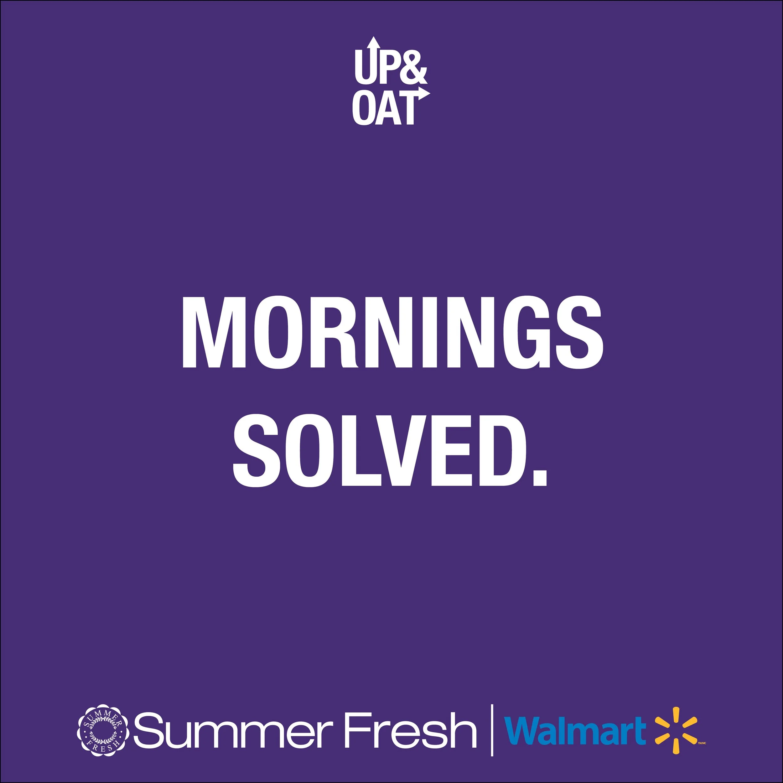
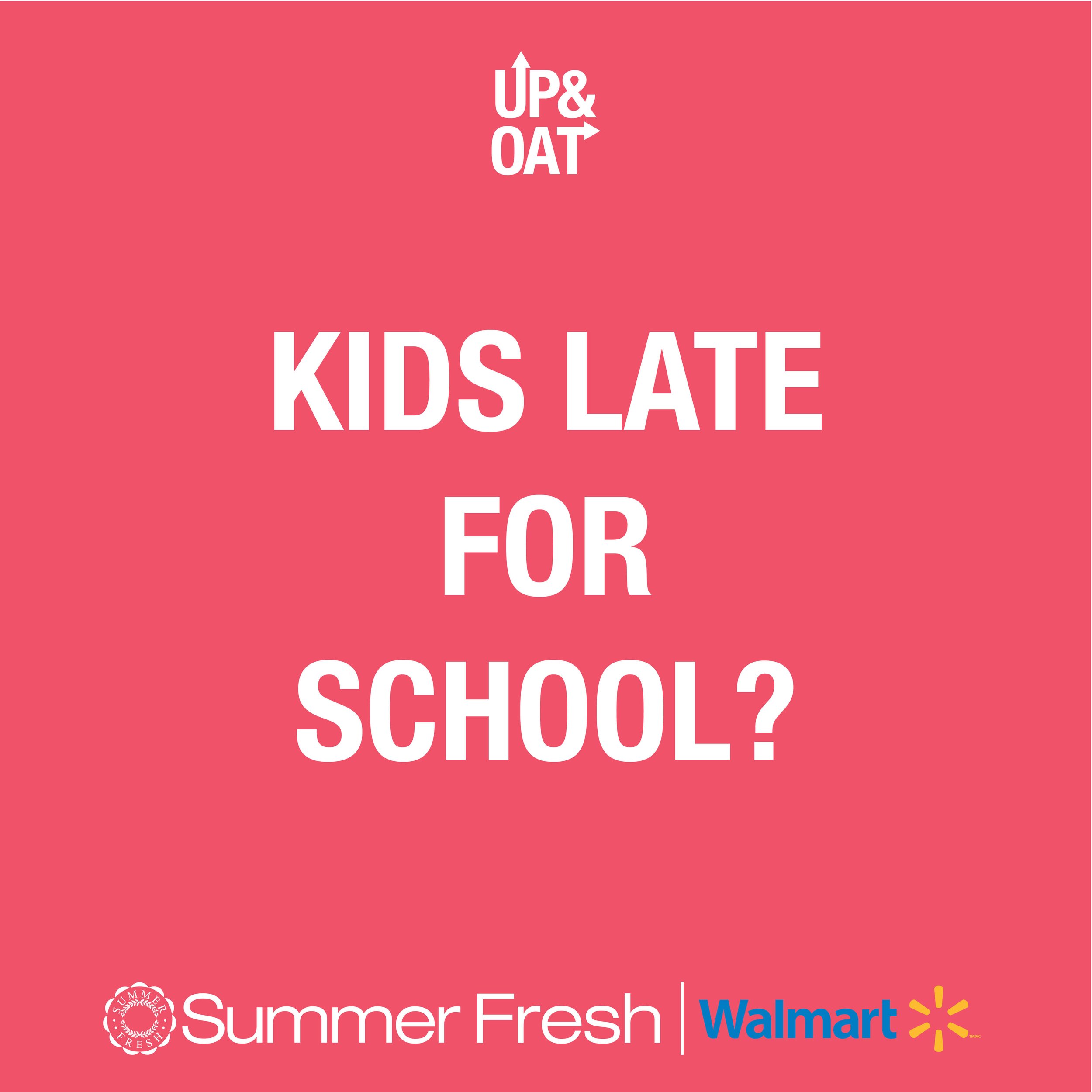
My concept for Advertising and a Social Media Approach was simple: what is one thing all people can relate to? Not having enough time for breakfast for one reason or another. Woke up late? Forgot about an important meeting? Kids late for school? The idea was that no matter what is holding you back in the morning - there is an easy and quick solution to get you where you need to be while also allowing yourself to have a full-filling breakfast on the go. Below you will find a concept for each of the flavours. These specifically were proposed for Instagram, running 3 across in a row once posted together. At the time, they were at Walmart exclusively.
I believe this idea could also be used in Advertising through Print, Billboards, Digital Ads and Campaigns.